Lauren Gillette Photography
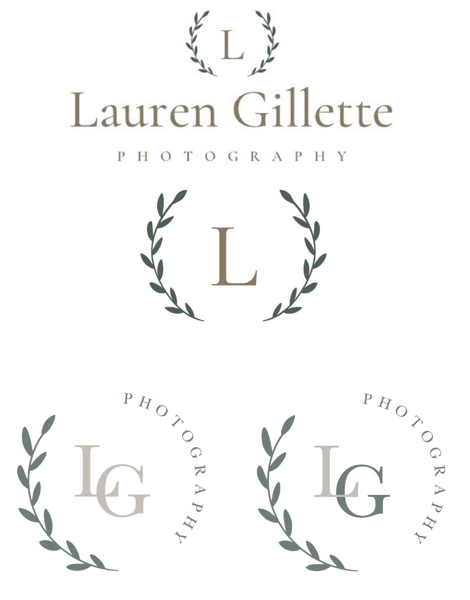
The first two logos on the left are the originals that Lauren had designed herself. She specified that she had a special attachment to the laurel wreath in her previous logo and would like that to be in the new iterations. She was looking for something simple and clean that had fall, neutral colors. Something classic that wouldn't take away from her photos. She also did not want something very different from what she had previously, just a nice refresher of her logo.
Taking all of her wants in mind, I designed the bottom two options for Lauren. I went with something super simple and very much in the same realm as her previous logos. I did include the laurel wreath that she requested. I liked the idea of a implied circle that could relate back to a camera lens. I used a font very similar to the one she previously had as to not abruptly change the identification that she had previously built with her audience. I do feel like that font is a very classic and timeless font that does not apply to any trends.
I gave her two options to pick from - one with monochrome initials and the other with colors within the color palette. The logo on the left lends itself more to the feel of a classic timeless logo whereas the logo on the right adds a little bit of fun/spin on the classic feel. She did end up going with the one on the right - with the different colored monogram.
Below on the left is a mockup of a business card that she would be able to hand out to clients, have available at weddings for guests to be able to pick up and carry with her at photography events that she attends. I chose a classic, clean yet playful design.
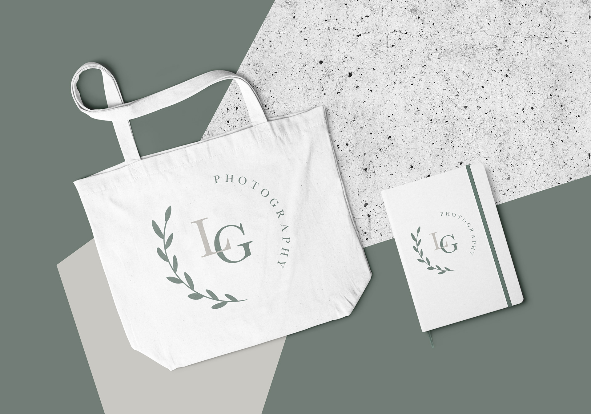
I also designed a mockup for a tote bag that she could use to carry event day needs so that she has her brand on full display and it is a great and easy marketing tool. The notebook would be great for her to keep all of the details of shoots she's done or scheduling information with clients as well as other business cards that she may receive.