
Hastings Mutual Insurance Company Building Artwork
I was sought out on this project to add my style to designs that would go around the building. I was brought in to add my more modern, illustrative style. They wanted something that wouldn't be dated as these designs would be up for probably 10+ years. This was a project with myself, Hastings' Brand Content Specialist, Web Content Specialist and Multi-Media Specialist. Eventually myself and the Multi-Media Specialist became co-project managers and presented to the building committee as well as the Marketing Vice President, Human Resource Vice President and the now President and CEO of the company.
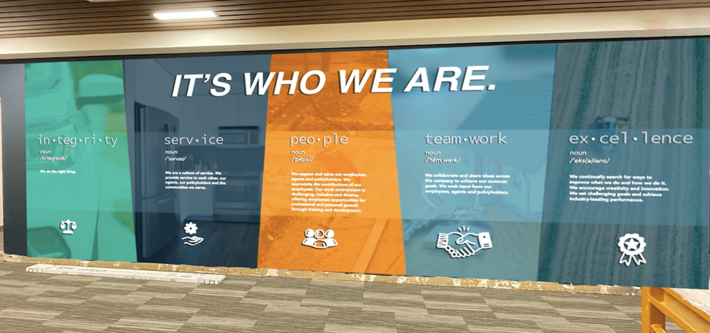
Above is a mockup of the wall outside of the cafeteria. It was important for me to show Hastings' Core Values as a company but make it aesthetically pleasing so it didn't feel like even on a lunch break, you were still having the company push things on you. I designed the Core Values after dictionary definitions so that they are Hastings' definition of these values. I added hand-drawn icons that were easily recognizable at a glance. Behind the definitions, I added images of coverages that Hastings' offers to tie back to Hastings and make it more personable.
Hallway Wall 1

Hallway Wall 2
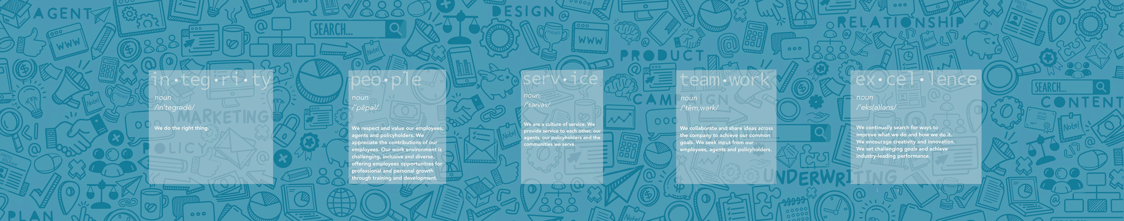
Above is a mockup of a hallway that Hastings wanted to use as a messaging area between departments on that floor. I hand-drew icons that related to business and hid a couple specifically of Hastings memories. I also added some keywords and departments that added to the personalization. The Core Values would be on acrylic or glass plaques that would stand away from the wall to create a 3-dimensional space. Since this side was so busy, I went with something that was super simple yet complimented the design. On the other side, "Recognize Your Co-Workers" would be printed or painted on the wall. The wall would either be magnetic or chalk. I wanted this to be a fully functional, working wall where employees could tack up an award, thank you, shout out or whatever it may be to recognize those that they were working alongside. This greatly improves tension between departments as well as promotes healthy relationships and a great atmosphere where people feel valued.
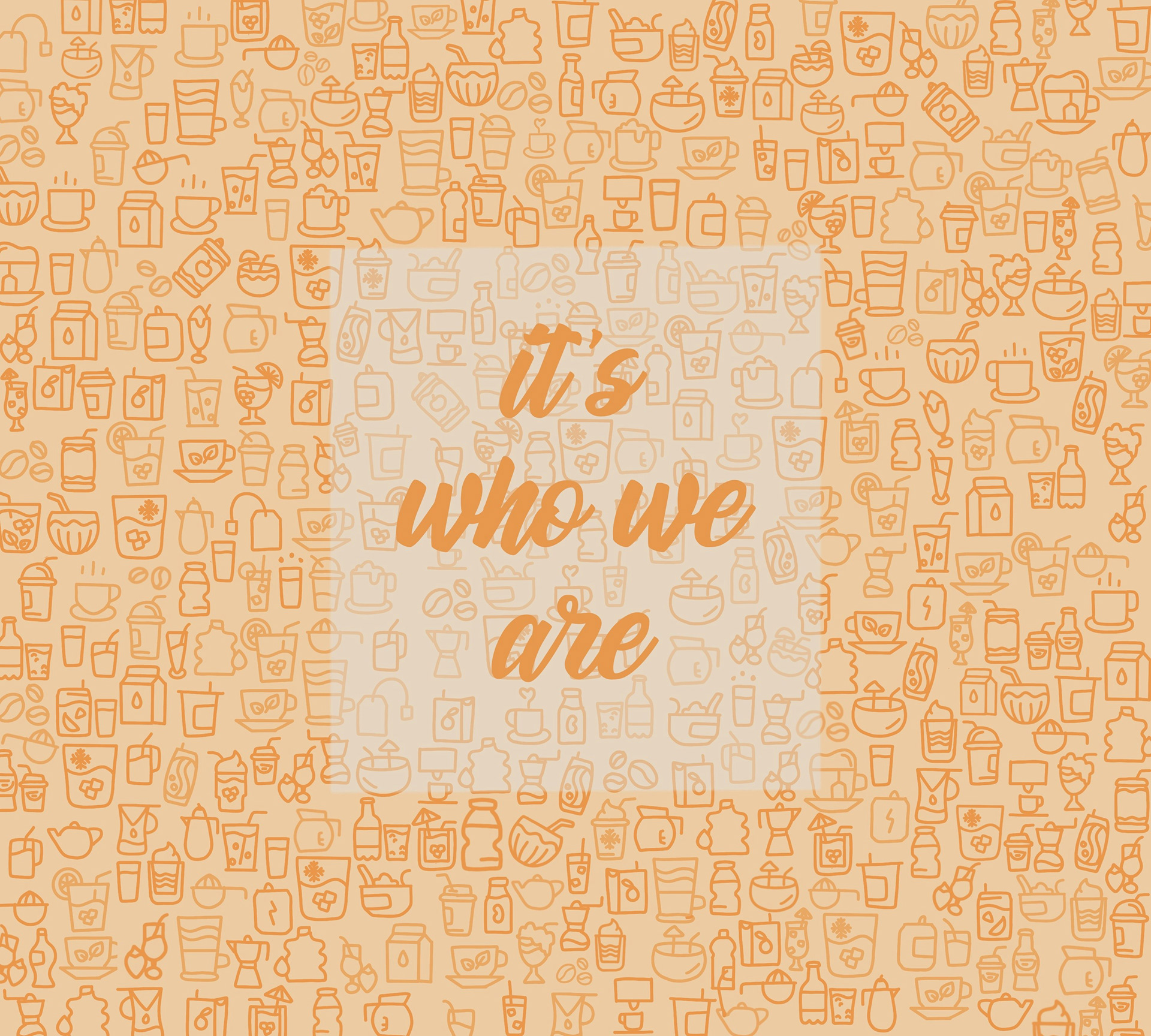
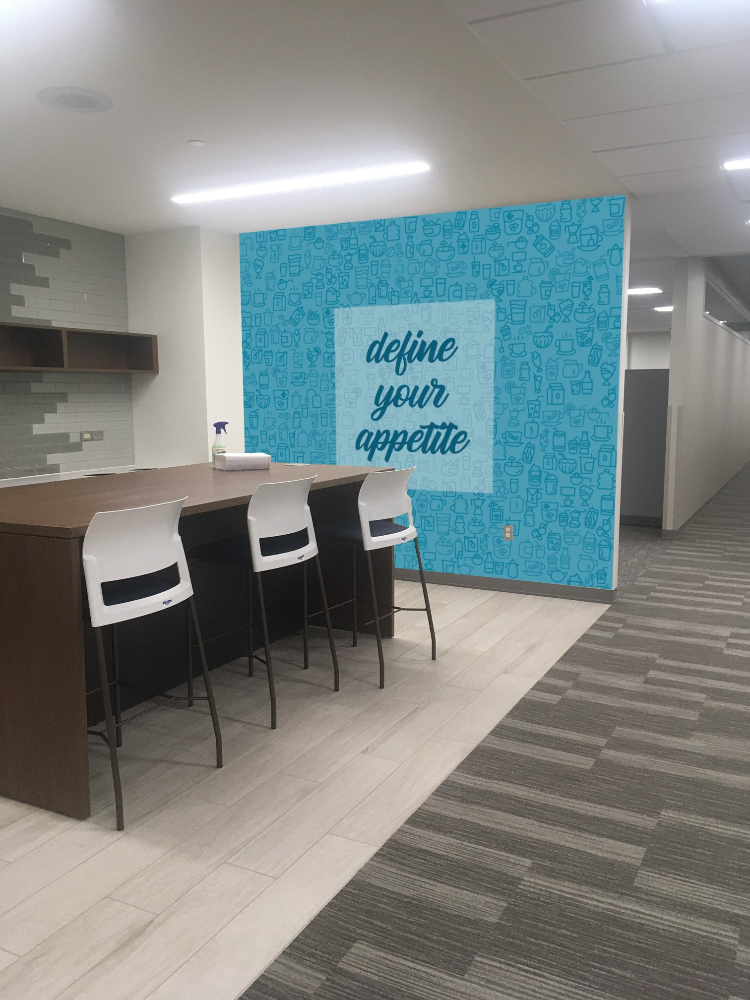
Drink Station
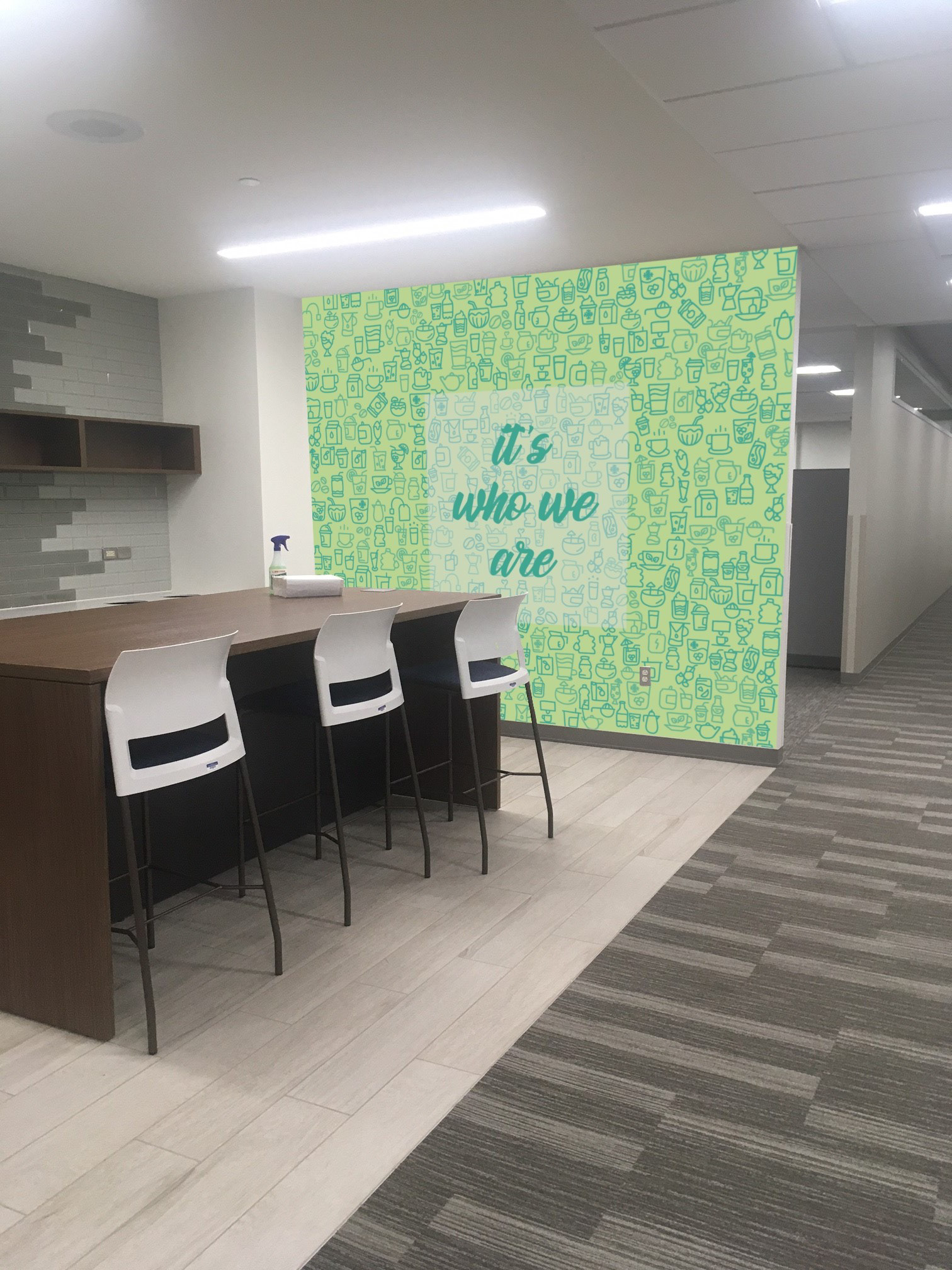
Drink Station
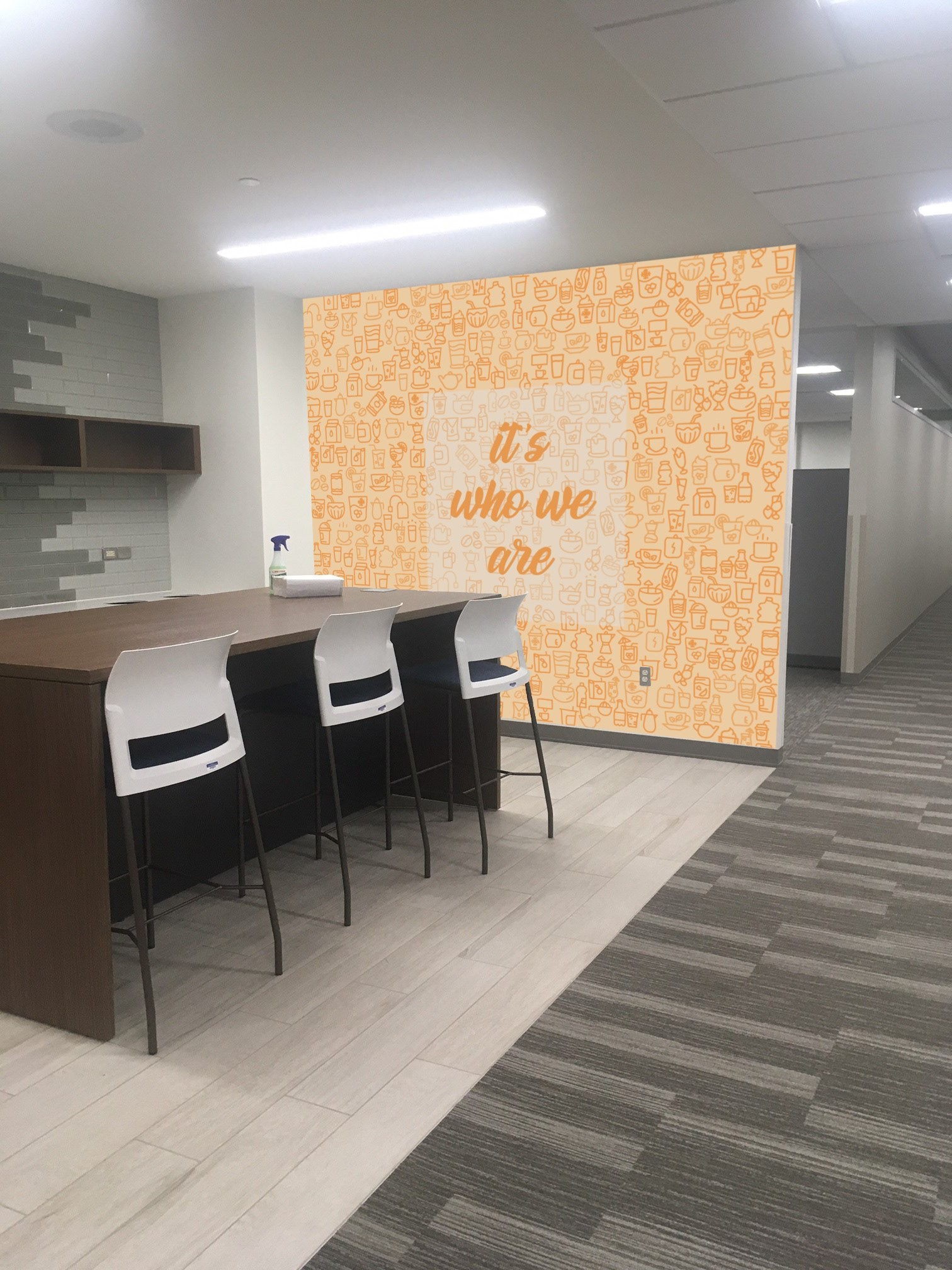
Drink Station
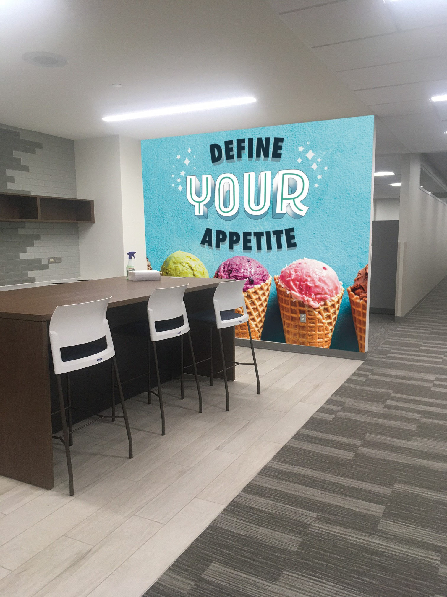
Drink Station
Drink Station
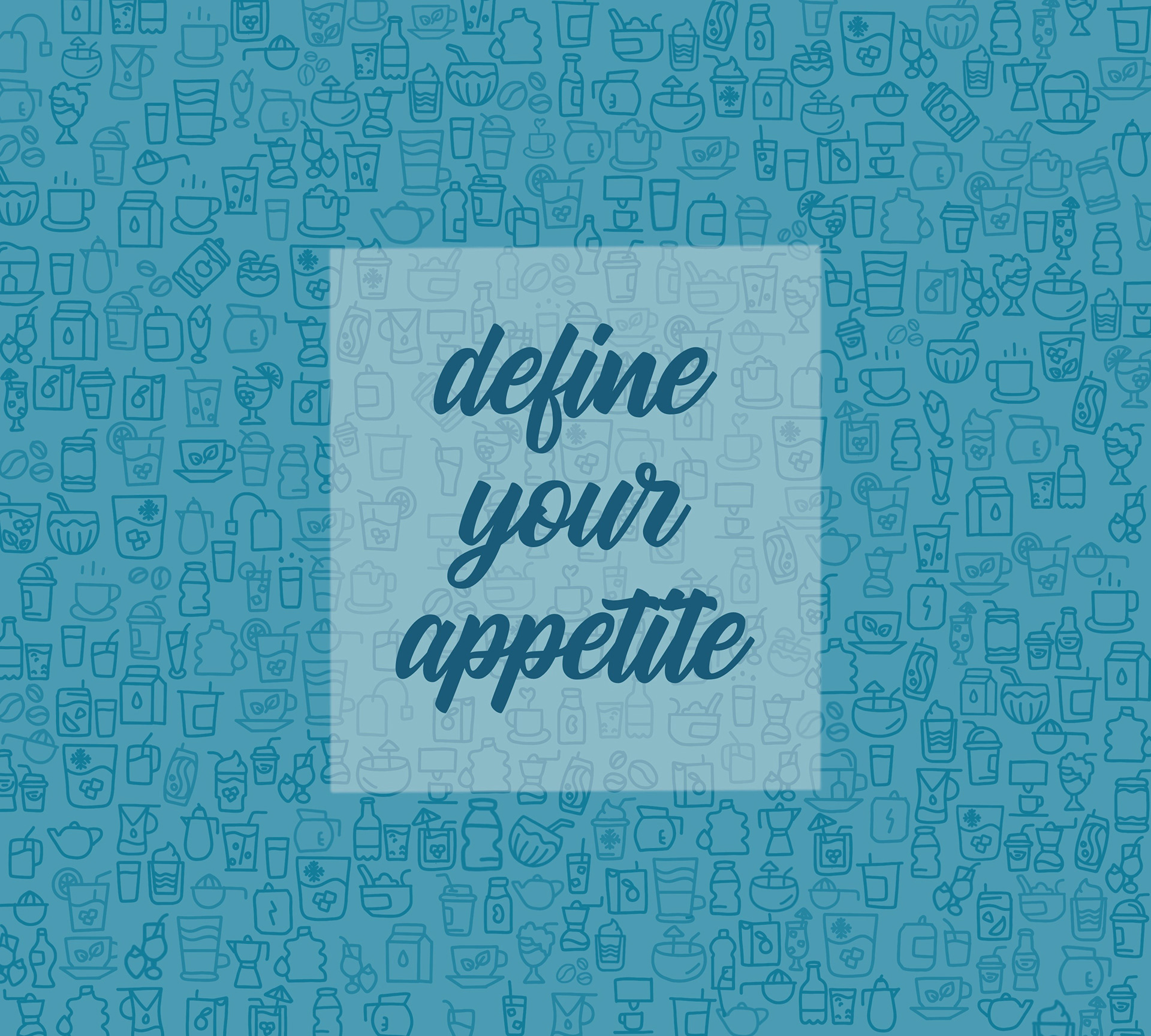
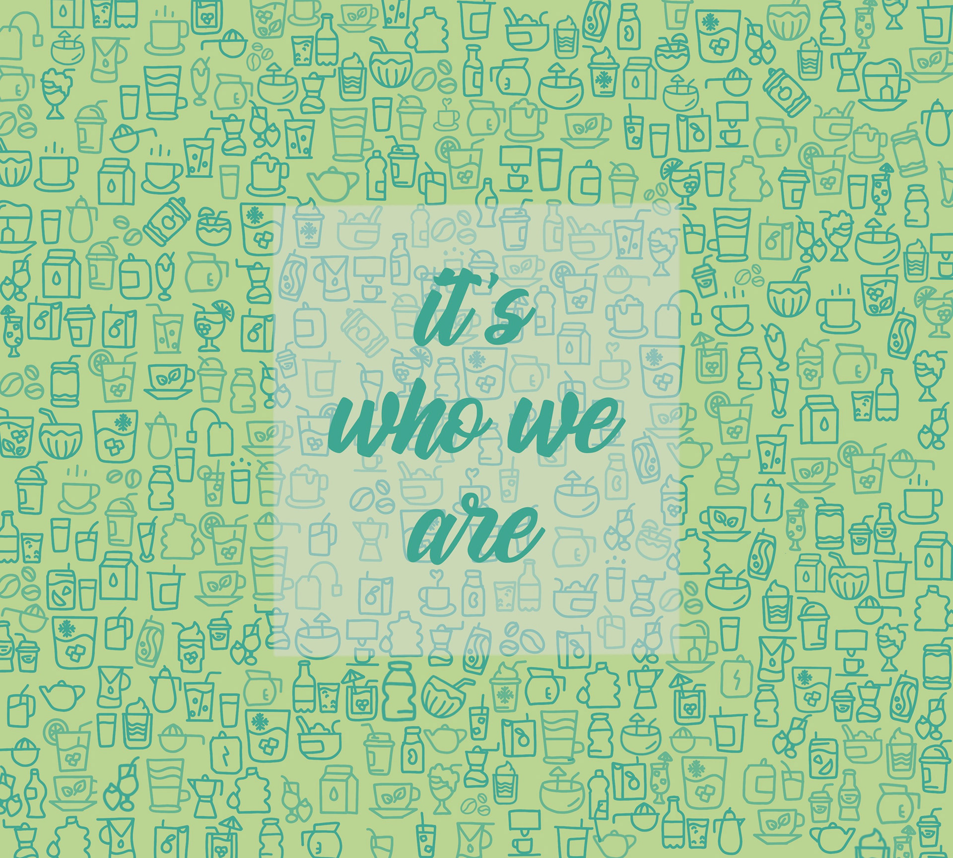
For the Drink Station, I really wanted to play around and have a fun, bright pattern-like wall. The key to this area was I wanted somewhere that would distract an individual for a few minutes from whatever they were working on or whatever they were stressed about and give them something fun and lighthearted to look at while filling their water or getting a beverage. It was important for me for this area to reflect what this area is used for, hence the hand-drawn drinks as the background image. I envisioned the opaque white box with the quote to be put on a acrylic sheet that popped out of the wall so that there was a 3-dimensional effect and it wasn't just a flat image on the wall. The quotes are specifically handpicked for the floors that they would have been placed on. Underwriting has always had a motto of "Define your appetite" meaning refine what policies Hastings wanted to write/cover. Hastings has always had the motto of "It's who we are" to seem more personable to the policy holders and that they will always do the right thing. I used Hastings secondary colors for something different instead of the monotonous dark blue and safety orange that is normally pushed. I also designed one with hand-drawn "Define your appetite" alongside an image of ice cream as one of the treats that Hastings offers is having the Schwann's truck come every couple weeks when the weather gets nice. I thought that image ties back into things that the company has to offer and is not something randomly picked.