
A Home Warranty Company was intending to create a new branch of their company that translated their current warranties into Spanish to create a more inclusive environment. As Lead Graphic Designer, I was given free rein to create a couple logos that would then be tested in group rounds and eventually debuted to the CEO and Owner of the company.
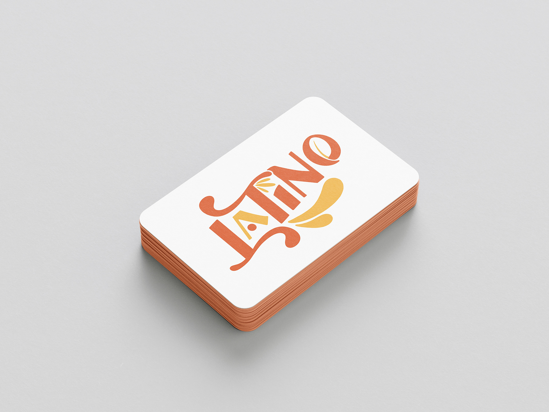
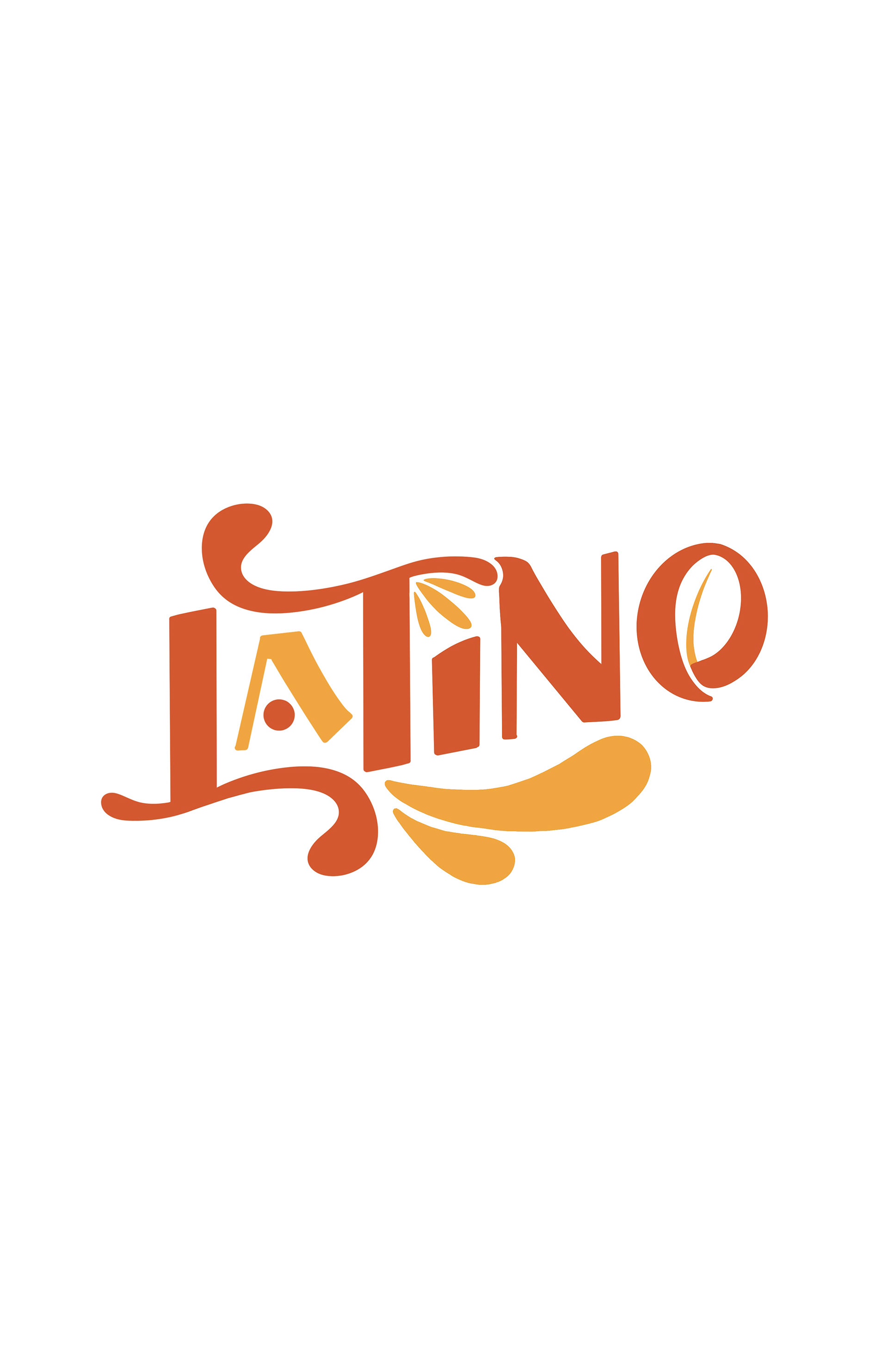
I researched logos in the Latino culture as well as colors and items that would resonate. In my research, I found the darker orange color pointed back to the Terracotta roofs that are still present in the culture. In the 'O', I included a coffee bean. The 'A' was turned into a house to represent the family aspect as well as point back to Home Warranty.
All three of the logos below were hand drawn.
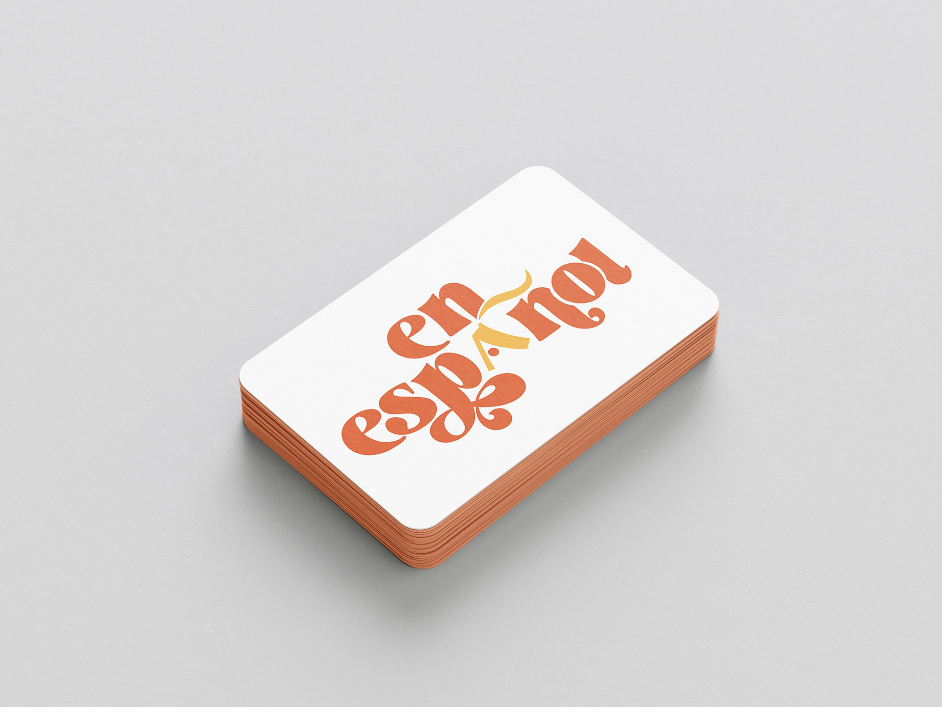
En Espanol
The Latino logo was approved and then rejected due to the wording. Latino would cut out some of the culture that the company was trying to reach so the name was changed to En Espanol which started new drafts and continued research in order to follow a great logo.
The logo below was one option that was friendlier due to the lowercase and the overlapping. I again added the house to point back to family culture and APHW. This was the logo that was chosen by the test groups as well as upper management and is what the company is using to this day.
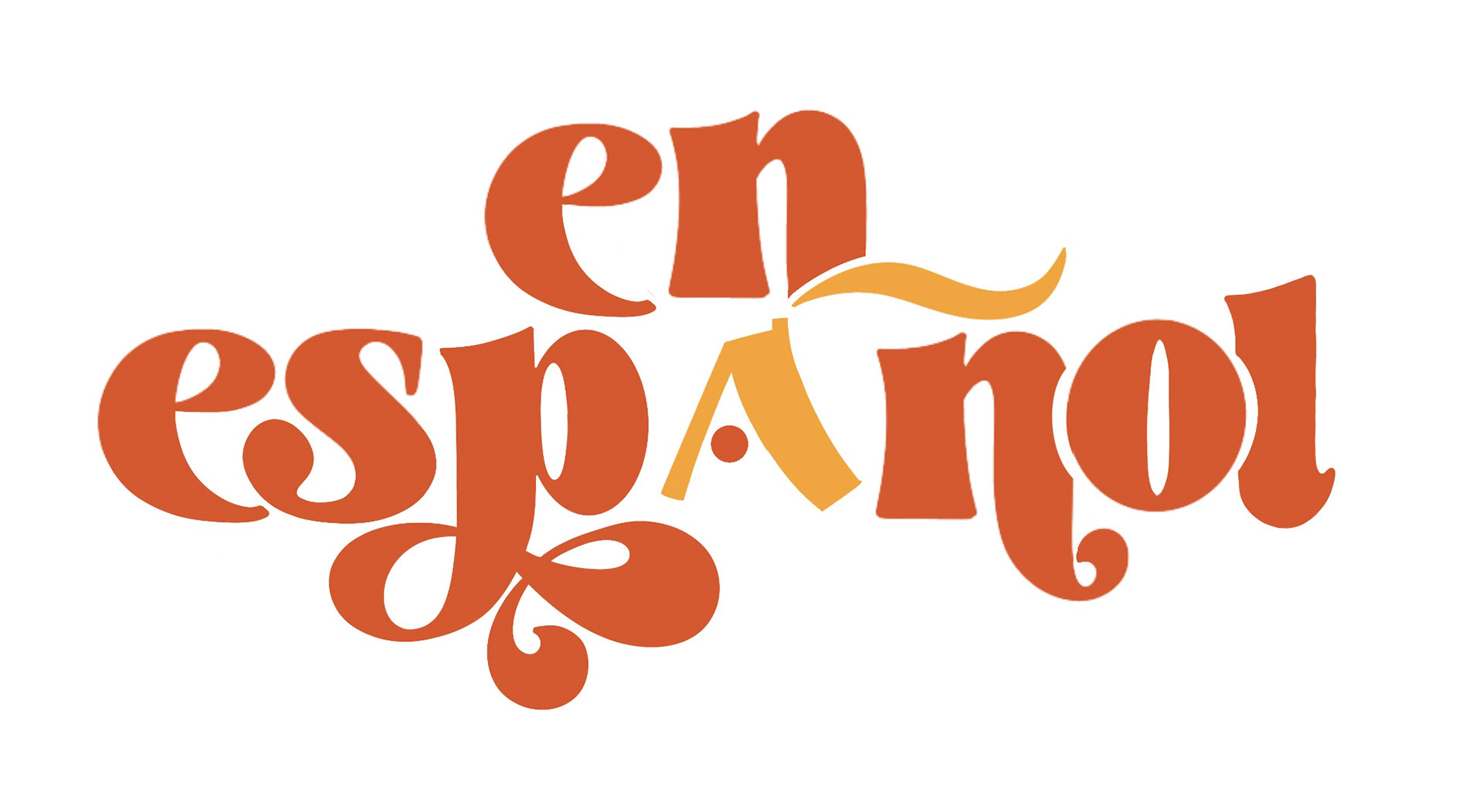
The logo below is a different variation that is a bit more of an older style with the cursive like font.

