Mindie's Diner Rebrand
This was a branding project based on a 1950's diner and the aesthetics that came from that time period.
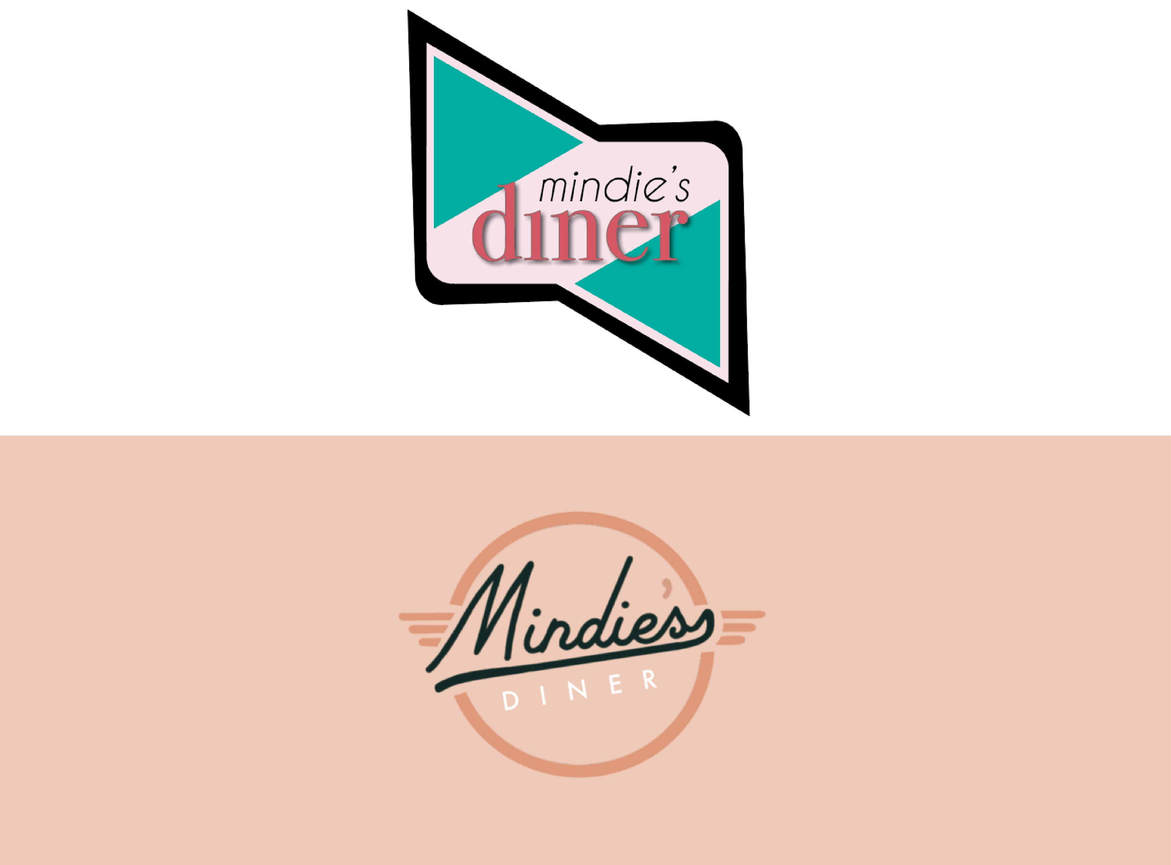
The original logo on the top was one that I designed while in school in 2018 was meant to be fun and playful, much like the typical 1950's aesthetic. It does very much look like a starting designer made it and there was a lot wrong with it.
The new logo that I designed in 2022 offers a much more sophisticated feel that does play into the playful look that I was originally going for but could not successfully execute. I wanted to draw the eye to the name of the diner instead of what it is as I wanted to promote brand recognition. I feel that patrons would call this place Mindie's as opposed to just calling it a diner. For that recognition, I hand wrote the font to almost look like a signature. I feel that that makes it much more personal and patrons will feel like it will be a more personalized, home-town experience instead of a chain restaurant, get in and get out feeling.
Mindie's Diner is a tribute to my mom who has always been my biggest supporter and my biggest fan in my design career.
I feel that it is important to go back to my previous work that possibly could have been my "best yet" and work on the ideas/concepts. I feel that it helps me grow as a designer to be able to look at my own work and see the imperfections and see what I possibly could have done differently. It also helps me not be so attached to my work that I am unwilling to step back and admit if it was a bad design in the first place.
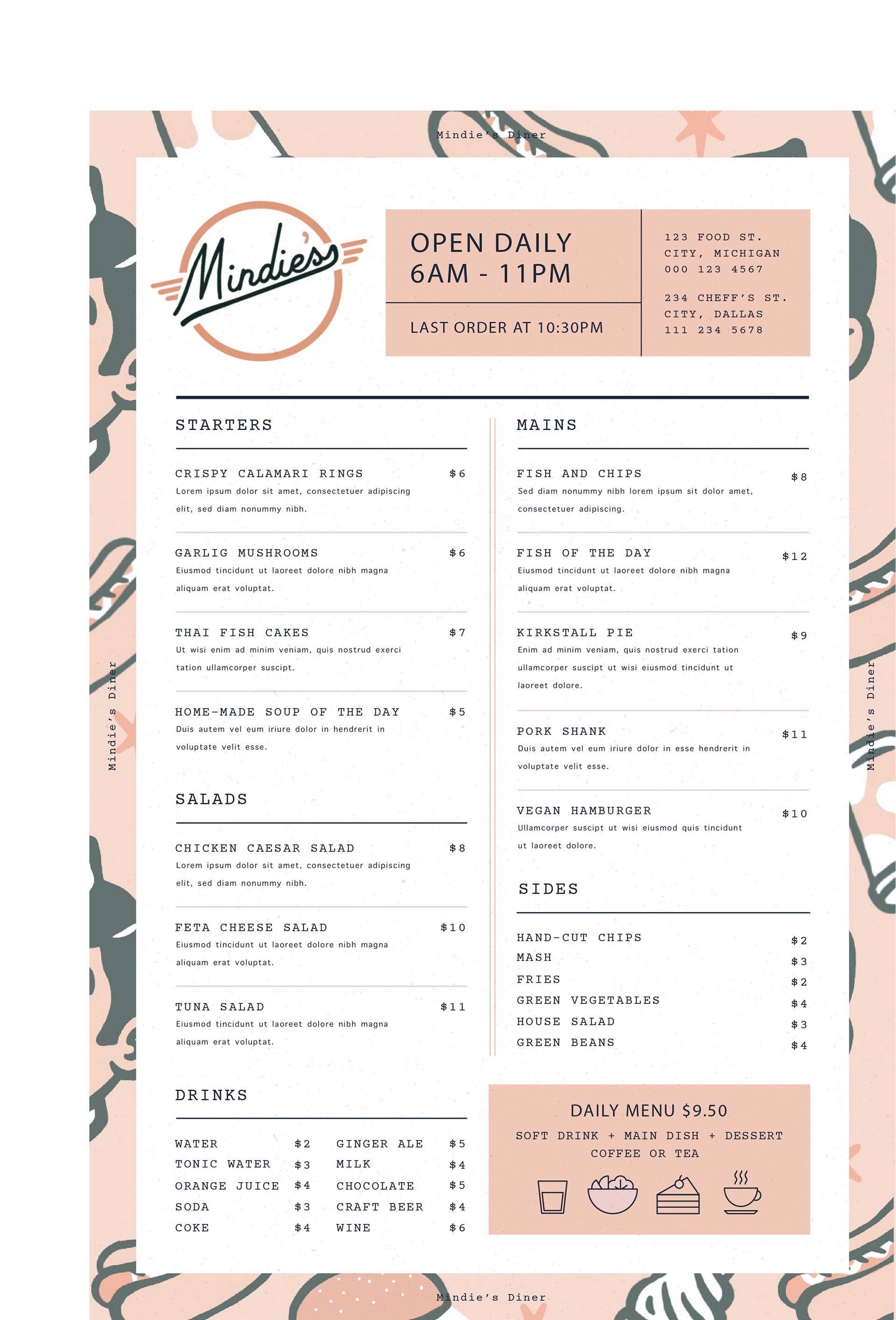
Below is a mockup of what I would have the menu look like. I went with a more classic feel for the menu portion as I feel like the graphics behind draw most of the attention. I wanted something super simple that drew the eye to the important features such as hours and locations, and the daily menu.